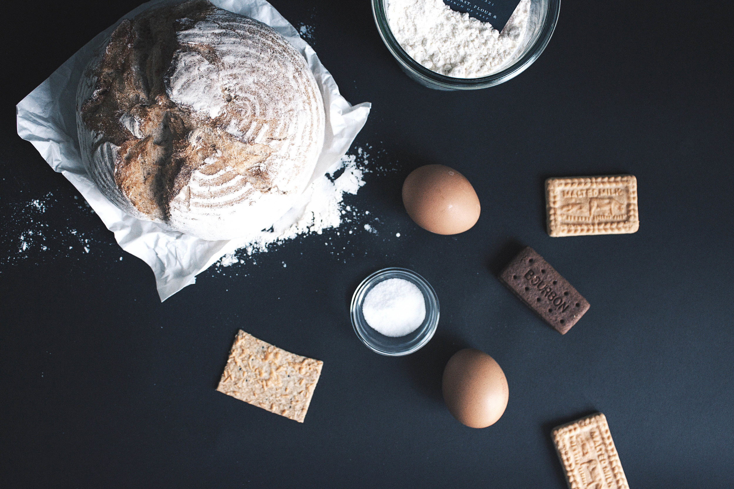
Bread & Biscuit

Bread&Biscuit, an experimental brand conceptualised by Oddds. Staples like bread and biscuits invites the familiarity of comfort.
With a straightforward naming, the logotype is drawn from custom made typography and font.
A clear and modern interpretation of san-serif italicised characters, slanted, curved and generously spaced; a slight sense of contrast in comparison to the secondary serif font used throughout the identity.
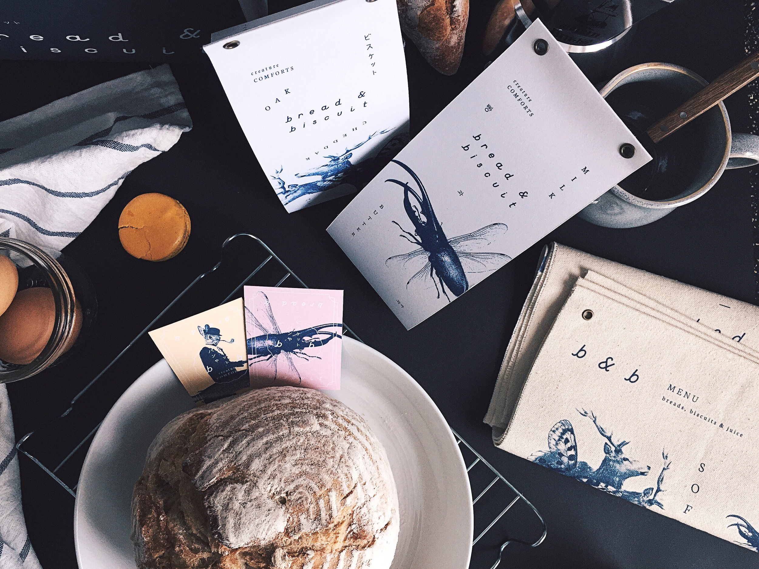
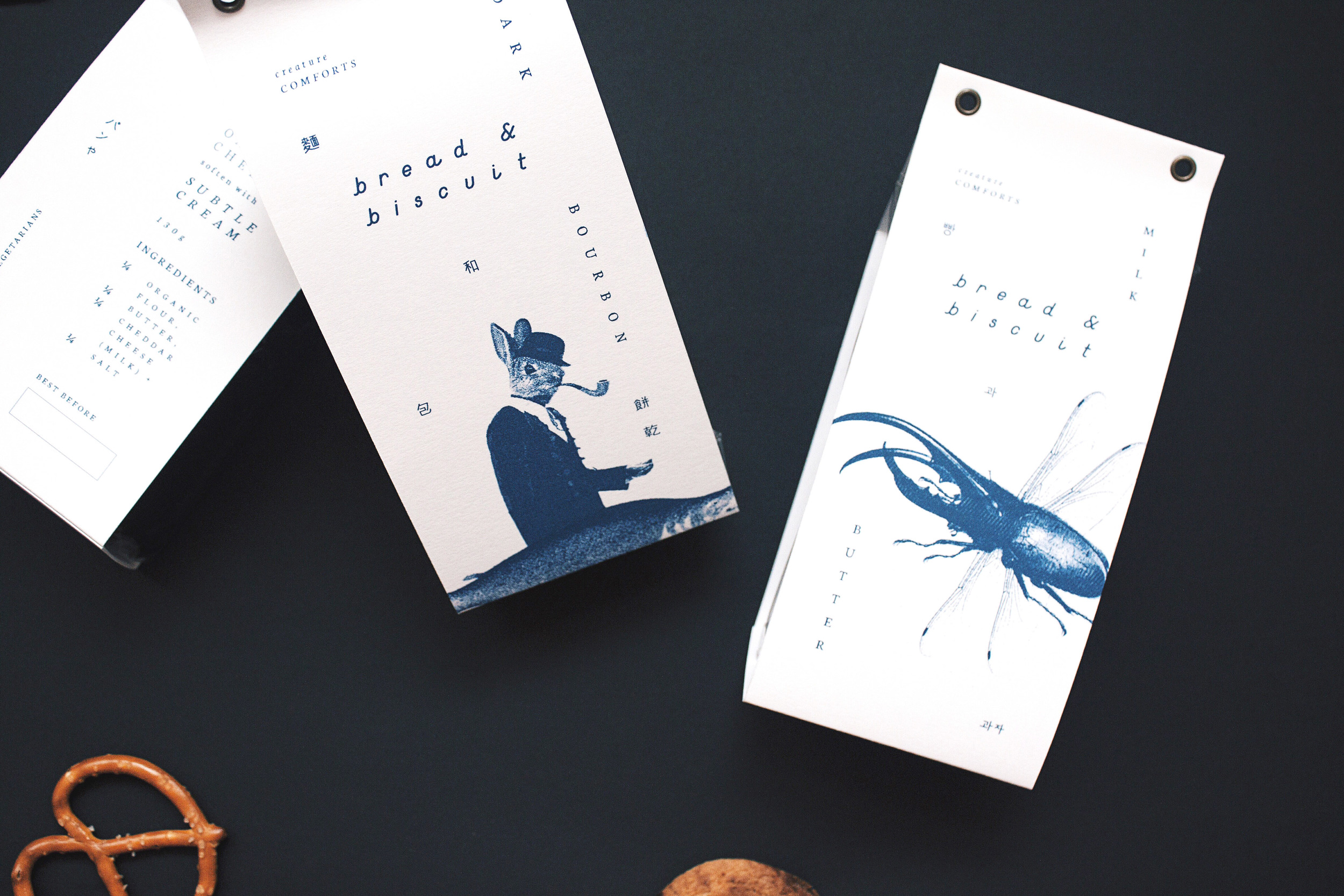
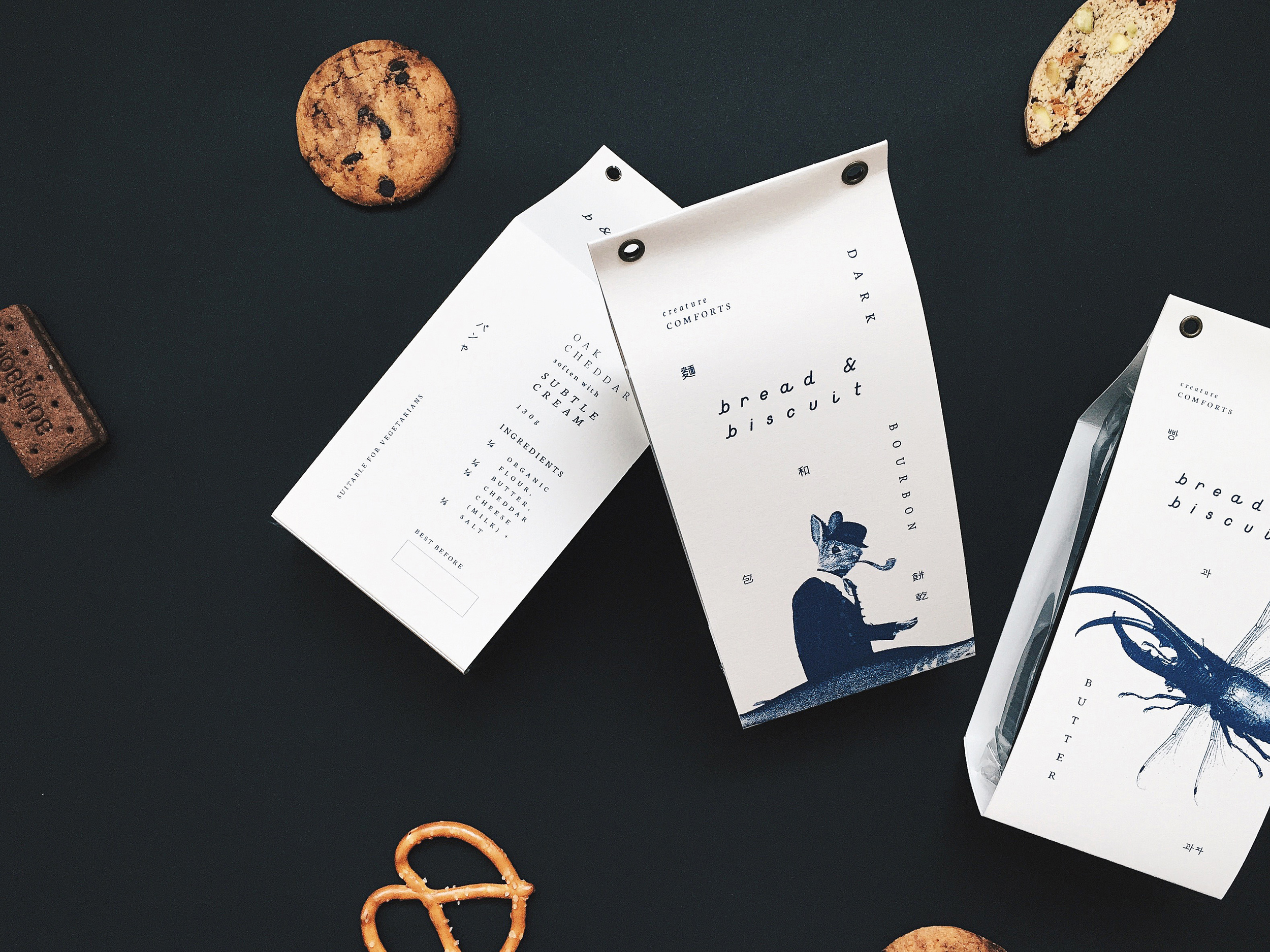
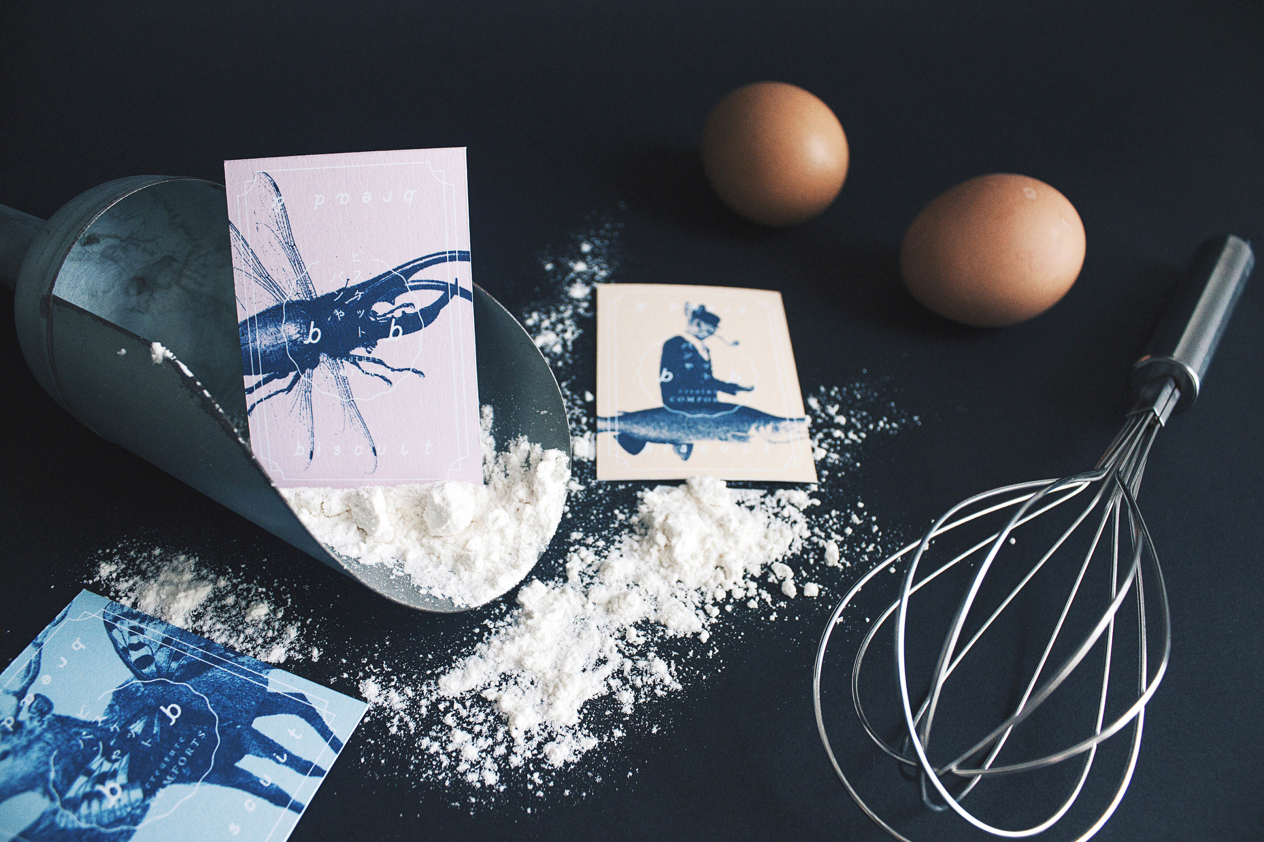
The intricacy of Bread&Biscuit emerges with the usage of de-constructed illustrations and play of free-form typography. Executed and resulting in hybrid creatures walking into foreign lands (metaphorically), unsure of their surroundings only to be freely interpreted kind or wicked and translated by its viewer. Thus, transforming into linguistic imagination with the exploration of four different languages (namely English, Korean, Japanese and Traditional Chinese) seen in the branding. A fusion of reality versus imagination where the knowing becomes part actual and part tangible.
On the contrary, the complexity of these illustrations creates much room for inquisitiveness. The metamorphic deer and butterfly derive from the soft and gentle foldings of yeast into the flour. The formation of beetle and dragonfly are rooted from the simplicity of mere humble ingredients as they transform (raising of dough). The modification of rabbit and salmon introduces a delightful new surprise (baked bread) always returning to its roots and place of creation.
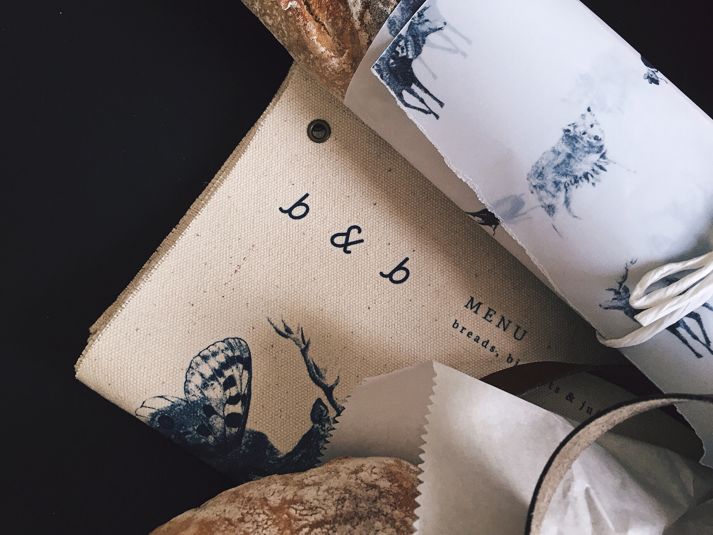
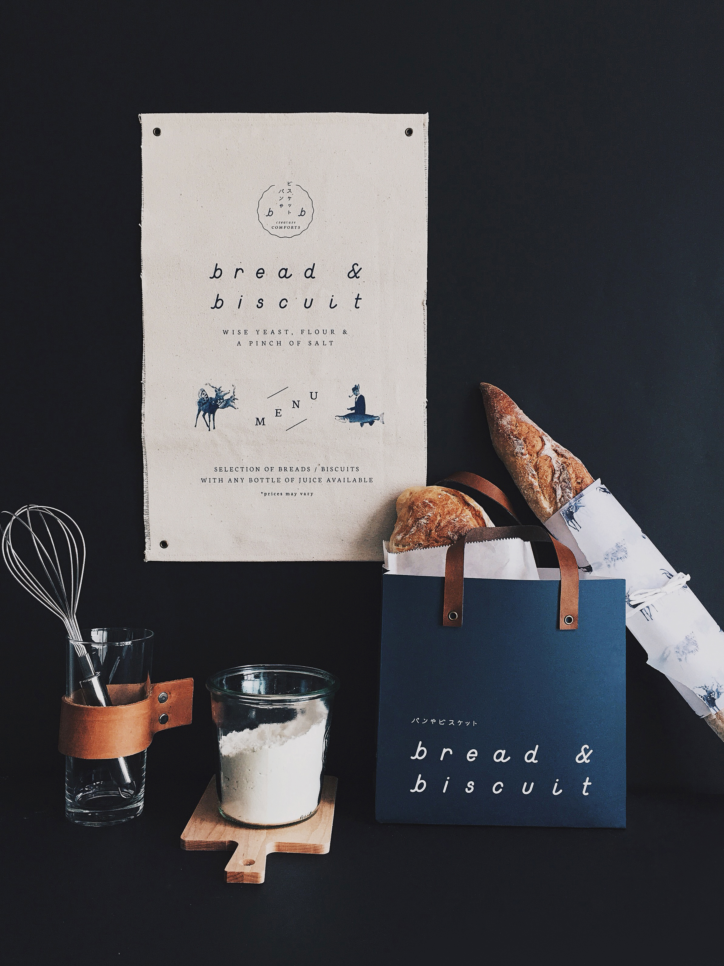
A palette of navy blues complementary with tan browns and hints of soft pastels eases into the identity. The adding of minimal lines in the identity system creates unstructured energy. Collaterals were extended to business cards, biscuit packaging sealed with antique brass eyelets, a paper carrier bag with leather handles to juice bottles. The designers opted to design the menus to be printed on raw canvas (individually and intentionally made with worn edges) instead of the conventional usage of paper to add the sense of continually and eco-functionality.